Posts

Ps Tutorial

Image
For the Ps Tutorial, we were using different color layers on top of a black and white photo. To do this we used a lower opacity on a brush to make each object on the girl look a different color. Overall this helped me understand what kind of colors and techniques I was going to use on my own portrait.

Ai Tutorial

Image
For this Pear tutorial, we introduced the mesh tool and how it will aid us in our final Ai project of the canvas project. Using the shading tool has taught me that it's essential to make sure all colors are evenly haded to make it look more real.

DW Tutorial

Image
Here are the DreamWeaver, Adobe tutorials.  These two tutorials, which guided me through how to code, is what helped me create the final canvas project.

Basketball Chocolate Fountain

Image
For this extra Credit option, I combined two of my favorite things in life, chocolate and basketball. For the basketball and hoop, I traced these off an example image. For the chocolate and strawberries, they were drawn on Illustrator. This is made to look like a chocolate fountain machine, instead using the hoop as the fountain and basketball as the stand. The Strawberries at the end were extra detail which made it easier for the viewer to understand. This project took a couple of hours and was a great way to finish the semester.

Final Portfolio

Image
My Final Portfolio I am very proud of! Hopefully you enjoy this blog as much as I have enjoyed making it! :)

Business Cards

Image
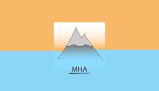
For my first business cards, I made sure my logo was clear and incorporated colors that were involved in the mountain. The dots make the card stand out and continue the blue. water trend throughout the front of the card. This and the third card are probably my favorite. For the second card design, I found it very difficult to use the darker colors in my card. I tried to incorporate the purple into the front of my card but it came out looking disjointed from the rest of the card. Overall, this would be my least favorite card. For my last business card, the colors that were used were very simple and linked the whole card together. The pattern I created on the back, personally, looks really good and helps the focus of the viewer go to the logo. The total layout of the card makes sense and the information on the front is very clear and obvious.  Overall, this process took 3-4 hours and it was a very enjoyable task as it is something I will need to use shor