Popular posts from this blog
Blog 1
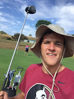
My name is Thomas Hughson, I'm from New Zealand, I'm really into expressing myself and my opinions so I'm hoping to do that in this course in some way or another. I love any sport, but my most serious sport is swimming. I am wanting to major in International Business and Management, so this course is really for me to explore how I can relate technology in Media, to help my career in Business. I loved photography at High School and ended up finishing my year producing some very deep and meaningful photos with Photoshop that I was very proud of. I want to keep it as a hobby throughout my time here in Tampa and in the future, so experiencing more in-depth work in Adobe will help keep me interested. I have 3 siblings in my family, one younger brother(Oliver,16) and 2 older sisters(Sarah,22)(Jess,24). My Mum is a primary school teacher, and my Dad has his own business. My first thoughts of the Digital Media Class was good. Professor Blanka Roundtree seems very knowledgeable ...


Comments
Post a Comment