Posts

Showing posts from October, 2019

Portrait

Image
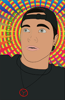
The purpose of my portrait was to create an identical image of myself while keeping the concept of my portrait very simple. I started with the outline of the image, making sure every major part of the image I used was sketched. Next was the identifying of colors for my face, eyes and mouth. The most difficult part that I couldn't do very well was the shading of my face, there is a small portion of my face that has been shaded, but the difficulty came from not wanting it looking obvious. So I made sure the shading was minimal which kept the simplicity. The quote 'GO WITH THE FLOW' is something I drive to be like everyday. Making sure that at every turn in life, I have an open mind and take the journey as it comes. The idea of peace in the necklace also related to how I live my life. Back home, being natural in the way I eat and live is important to myself and the planet we live in. The background image also helped have more color, plus zooming the attention onto the po...

Boxing Glove

Image
Using Illustrator and the mesh tool, I created a boxing glove. The image I created is on the right. This process took around 3 hours and a lot of mistakes were made(and its still not perfect). I begun with tracing the image using mainly the pen tool. I made sure that every detail was done from the original image to make sure they were almost identical at the end. after tracing I began using the mesh tool, which unfortunately was causing me a lot of trouble with the weird outline I used. So instead of using the mesh tool for all of the shadows, I used the curvature tool firstly to outline the shape, then using the mesh tool inside the shape, to merge the colors. Overall, this was a good place to get my head space in check before moving onto creating my face using illustrator.

Colored Logos of Mt Taranaki

Image
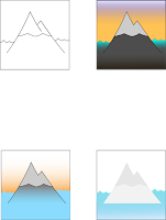
After finding my Logo in Black and White, I wanted to put colors that were significant to me and link them some how in the water + mountain. My favourite logo out of the three is the bottom left. The simple blue, the slow color fade into the grey of the mountain helps signify the connection between the two parts of my life. The Orange sunsets beauty signifies the wonders of life and how amazing the world we live in really is. The Patagonia logo of the 'sunset' colors was my motivation in this artwork.

Black and White Logo of Mt Taranaki

Image
For my Personal logo, I choose to do Mt Taranaki surrounded with water and how they are linked for me. The mountain is my home, it was where I was born and where my heart is. The water is my second home, where I found myself and found my purpose in life. Combined they are very significant parts of my life that I strive everyday for. I wanted to make this a very simple logo, not putting too much detail that the significance isn't lost. Simple is good for me, I have been taught that from a young age. The water being linked with the mountain has a lot of significance. Water is where I spend most of my day, and is where I have had my biggest struggles and successes! While the mountain is my roots, keeping the water in its place.